Day 7
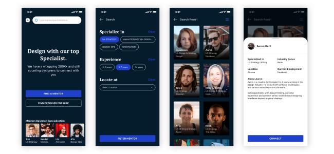
Design a Landing for a platform to look for Design Mentors
This COVID-19 era has brought so much change and impact to the world today, as well as to designers.
Designers had started to reach out to help their kin, by empowering the design community.
Instead of only preparing a place for a designer to look for mentors, might as well let help mentors/leaders find designers if they need also.
#fiz #quarantine #andyj
Post
Day 6
Redesign Homepage & Contact
I did a little research (basic 3 QnA) of asking 3 of my colleagues who loved this site also. Here is what I found:
1. The Random Drama section is irrelevant anymore (KA has a section where it features a random drama from the site)
2. They want to read a short synopsis from the Home instead of opening the page just to read the synopsis/summary
How do I relieve those pain points:
1. Introducing the Featured section We all love originals, so I designed a Featured section that is original and curated by the best from KA.
2. Provide a short-summary when Hovering the desired show Sleek and minimum interaction to prevent the site from being too cluttered by summaries. We don’t want a site where it’s full of texts, users are looking for entertainment from dramas, and it’s a point to show them more visuals and hide unnecessary texts.
3. Restructure the Hierarchy And as a bonus, I focused the site to show the most wanted user-needs. which Is what has been updated in the site, and the seasonal shows.
From this case, I learned that there is a section that we think could be popular, but it doesn't mean it will be popular for the end-users also.
Second is that validation and testing are really important. I wouldn't have realized that there is an irrelevant section if I didn't ask any of my colleagues.
An extra in the Contact screen, inserted a meme to bring a smile to our Sunday! Thanks for reading!
Original web: https://kissasian.sh/
#fiz #quarantine #andyj
Day 5 -- (Cont)
Here is the Light UI version in Sketch!
I laid down some of the loading animation screens as well.
#fiz #quarantine #andyj
Here is the Light UI version in Sketch!
I laid down some of the loading animation screens as well.
#fiz #quarantine #andyj
Day 4 Design Challenge
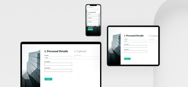
Responsive Resume Form
Mostly used by companies who wants to hire at a rapid-big scale.
Form are not meant to be long, there are some data we can collect at a later stage or with different method, say data inputs like Date of Birth and Gender (unless this is a necessity for the said position)
Discarding the nice-to-have and only include the must-have will boost the time consumed and experience filling the form from start to end.
Giving a touch of a professional-look, to show an identity that is trust-able aside from the simple form questions.
#fiz #quarantine #andyj
Day 3 Design Challenge
Design your Portfolio Website or Mobile App Interface
I always thought that story-telling is one of the essences when building impactful design.
It allows people to fathom and understand what you want to convey to them better.
And T-shaped designer is getting more these days, and I believe by having a diverse understanding of other fields will bring you to a new perspective.
At the very core, everything is back to Problem Solving, how we utilize and organize the information we had, and apply them to solve day-to-day problems.
"The more information you have, the more accurate your decision will be" -- I learned this from a specific someone
#fiz #quarantine #andyj
pwnbisht: love the way you present the story in a meaningful way. also the text 'turned' it's fun to present things like a story. I am also learning myself. Any advice and direction will be appreciable.
Day 2 Design Challenge
Home/Login Screen Redesign Challenge
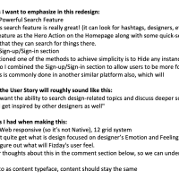
Fizday is a straightforward platform to connect designers, share difficulties/challenges, and talk about it. I decided to showcase these fortes in this redesign rendition.
(details attached)
Assumptions I had when making this:
1. Mobile & Web responsive (so it’s not Native), 12 grid system
2. Tbh I don’t quite get what is design focused on designer’s Emotion and Feeling. So I focused to figure out what will Fizday's user feel.
(tell me your thoughts about this in the comment section below, so we can understand this deeper 😁)
3. Use Roboto as content typeface, content should stay the same
Excited for the third challenge! how about you all?
#fiz #quarantine #andyj
Day 1 Design Challenge
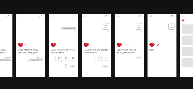
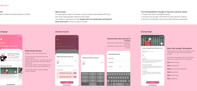
Make it Easier to Donate Money to Charity
Hi All,
I want to share what I manage to think and make for this design challenge, the idea is to make a platform for everyone who is busy and doesn't have much time to learn a new app just to make a quick-help for our friends in need.
Assumptions I had when making this:
1. I used the most used payment method globally (debit/credit card)
2. User logged in to the app & saved a debit/credit card account already
#fiz #quarantine #andyj


