Day Bonus Challenge
1. Can you tell us about yourself?
- Hello! My name is Ashish Rangwala. I’m a UX/UI designer based in Ahmedabad, India who loves tea, photography, and travelling. I am pursuing engineering but found my calling in design. I started designing since 2018 and currently working @underK.
2. What Made You Go Into UX Design?
- Whatever you do on a daily basis is an experience. I started to see small things can change user behaviour. I started reading about UX Design and loved the process of how it works and it’s exciting. Now, I’m passionate about improving the lives of others through design. I know when something isn’t right, and keep iterating on it until it is. 🙂
3. What’s Your Favorite Project You’ve Ever Worked on?
- It’s underK- an e-commerce clothing store. Designed both website and app; Modelling Photography and some graphics too. Working in an early-stage startup was an extremely steep learning curve. It was an eye-opening experience that taught me a lot about being lean and knowing when and where to focus your energy and efforts.
https://www.underk.in/
4. What Are Some Websites and Apps Whose Design You Love? Why?
- Medium - one of the best UX and UI.
Gpay App- it is easy to use, knows the user needs and contains one-page interaction.
5. How Do You Define UX?
- Process of designing products that are easy to use, user, can interact smoothly and values what the
product is providing.
6. WHAT INSPIRES YOU TO CREATE YOUR DESIGNS?
- Just connect with the right people and how perfect they are in their field inspires me to create
beautiful designs.
7. Who are your design heroes?
- Howard Pinksy, Nicola Guzowska
#fiz #quarantine #ui #ux #design
Post
Day 6 Design Challenge
The main goal of the redesign was to create a friendlier interface that would be understandable to
everyone, and more convenient navigation.
pain points
- Improper navigation.
- Cluttered Content.
- no breathing space.
Solution
- Main page combines all site categories and briefly shows the most popular articles.
- Structured and modern clean UI.
https://timesofindia.indiatimes.com/
Like, Comment & Share 🙂
#fiz #quarantine
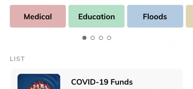
Millions of people give to charity on a regular basis to support causes they believe in, as well as for the positive effect it has on their own lives. But most of the times, we don’t get proper direction and enough time to achieve that. Hence I have proposed app pleasing the donators and receivers.
HOME PAGE
- Quick Donations Feature (Sometimes the needs are to be fulfilled under some
scheduling. They feel that getting the donations later doesn’t help much.)
- Can browse Charities by categories.
- List of charities.
CHARITY DETAILS
- A detailed description of charity.
- Funds raised till date.
- Related blogs.
DONATION
- Select the amount to donate.
- Select cards.
- User will get the satisfaction of offering the donations personally.
#fiz #quarantine #ui #ux #design
A prototype is attached in the next post.


