Day 2 challenge
Yes, I didn't redesign the landing page, instead, I worked on the "product" itself
I strongly believe Redesigning a product means "Make the present UI perfect " not by "completely changing the entire User interface "
My comments on the product :
1) Primary color "#FF5E3A" has only 3.03 contrast ratio and so the colors, tabs are not accessible
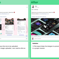
2) Cannot remove the images in attachment, need to refresh the entire page for this.
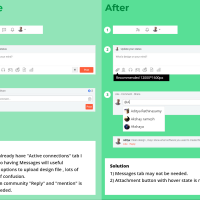
3) Mention, Reply Feature is much needed for a design community.
4) Expand and collapse of post description.
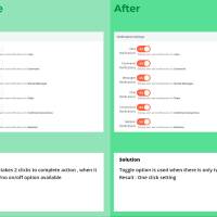
5) When someone likes your design post and you get notified commented on your "message ", looks confusing.
Please like and comment on your opinion. Spread love ❤️
Personal website: www.adityadesigns.com
#adityarm #fiz #quarantine #charity
Madhusudan Kacholiya: Hello Aditya, in the first picture, where the number of photographs is seen. According to me, if we convert the rectangle into a round rectangle then it looks quite good.
Post


