Bonus Challenges
#interview
1. Can you tell us about yourself?
I am graduated from journalism, I love to play music (drum) and I regular play drum every Sunday at my church.
2. What Made You Go Into UX Design?
When I lost my job few years ago, I started to learn to make website. At that moment, I know about UI and UX design.
3. What’s Your Favorite Project You’ve Ever Worked on?
When I was work for DHL Singapore
4. What Are Some Websites and Apps Whose Design You Love? Why?
To be honest, I don't have any favourite website or app.
5. How Do You Define UX?
How to make a product become easy to use.
6. WHAT INSPIRES YOU TO CREATE YOUR DESIGNS?
My wife and kids and people around me.
7. Who are your design heroes?
I don't have any design heroes, but I take my inspiration from dribbble and behance.
Post
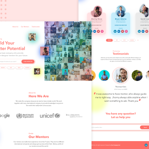
Day 7 Design Challenges
Landing Page
#fiz #quarantine
"Finally Done"
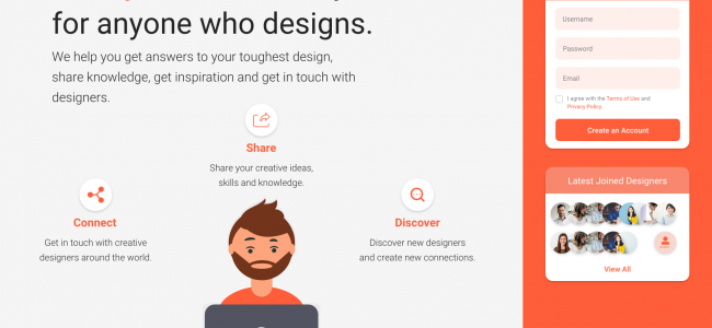
This is my final design challenge for Finding Designer Mentor (Web Concept).
I hope you like it. Thank You
All Design Challenge Source :
https://xd.adobe.com/view/2f74420f-7477-4655-75e4-8b7cc686c727-5945/
PEACE
Haris Silalahi
Landing Page
#fiz #quarantine
"Finally Done"
This is my final design challenge for Finding Designer Mentor (Web Concept).
I hope you like it. Thank You
All Design Challenge Source :
https://xd.adobe.com/view/2f74420f-7477-4655-75e4-8b7cc686c727-5945/
PEACE
Haris Silalahi
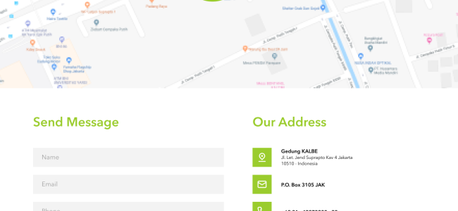
Day 6 - Case Study: https://www.kalbe.co.id/
Home Page: 1.I change the languages style with add flags with green color background and reposition to the top of page. 2.Home icon is not really common for new style of website. So, I use company logo as home button. 3.White color it’s not their main company design color, I change the white color background to green color as their company color. 4.I change the stock icon with new style icon. 5.Rename News title to Latest News, remove all news wording to only title of news and also make all images with consistent size. I put also more news button to see all news. 6. I use green color and put new image as background. 7. I put also social media icon as information of their activity.
Contact Page : 1. I add line at the bottom of contact title. 2. I make green circle as sign of location. 3. I change with square green color background. 4.For contact form, I create more simple style.
#fiz #quarantine
Haris Silalahi: Guys, I really apologise can't make clearly enough for my case study, because to update status only need 1000 characters, that why I cut a lot of my wording. Thank you
Day 5 Design Challenges (Light UI)
#fiz #quarantine
Original source file below :
https://xd.adobe.com/view/2f74420f-7477-4655-75e4-8b7cc686c727-5945/
Problem : User difficult to find their personal or important group because user they have many friends or relatives or anything. That's why user need a grouping went they in to the chat room platform.
Solution : I create different group name (button style), such as family, friends, brother, sisters or anything we want at the home page chat room platform. So, user will be easy and user friendly to find group.
Thank you,
(By the way, I spread with two post)
Haris Silalahi
Day 5 Design Challenges (Dark UI)
#fiz #quarantine
Original source file below :
https://xd.adobe.com/view/2f74420f-7477-4655-75e4-8b7cc686c727-5945/
Problem : User difficult to find their personal or important group because user they have many friends or relatives or anything. That's why user need a grouping went they in to the chat room platform.
Solution : I create different group name (button style), such as family, friends, brother, sisters or anything we want at the home page chat room platform. So, user will be easy and user friendly to find group.
Thank you,
(By the way, I spread with two post)
Haris Silalahi
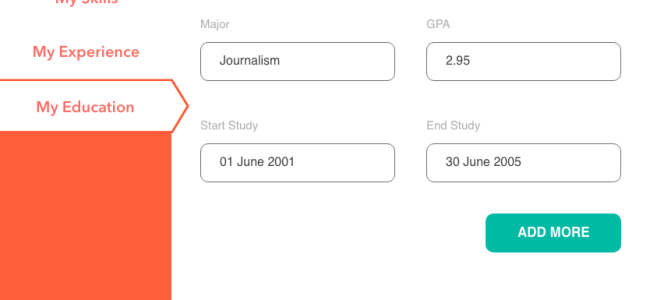
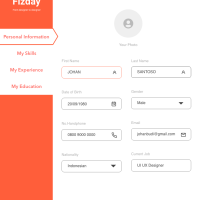
Day 4 Design Challenges
Responsive Resume Form
All Source Document File :
https://xd.adobe.com/view/2f74420f-7477-4655-75e4-8b7cc686c727-5945/
#fiz #quarantine
Responsive Resume Form
All Source Document File :
https://xd.adobe.com/view/2f74420f-7477-4655-75e4-8b7cc686c727-5945/
#fiz #quarantine


