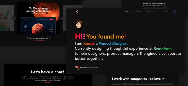
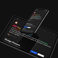
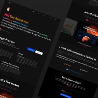
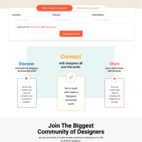
Day 7: Design a UI Landing Page to FInd Designer Mentors
It was one a hell of a week 🔥.
Kudos to @Fizday for an amazing initiative, and amazing assignments.
So here is my take on the above-stated problem statement.
Before I put my last take, there is a quote that's hitting my mind right now, that I would like to share- "Sometimes its the journey that teaches us a lot about the destination". 😀
All the best everyone.
( P.S I hope I win though. 😂😛🤞)
On a serious note, great initiative @antivirusakash 👍.
I would be looking forward to @saptarshi @uyen @yashashwi feedback.
Lastly, as it says: Keep on LEARNOVATION ( Learnovate - Learn to Innovate ) 👍
Like it. Share it. Appreciate it. https://dribbble.com/komalag24
#fiz #quarantindesignchallenge #bestquarantinedesigner
Komal Agarwal : @adityarm No there were many others as well who did a great great work with the challenges. So! *fingers crossed*
Post
Day 6: Redesign Home & Contact Page of your favorite Website
So here I am with my favorite website Re-design: STARBUCKS ( I am not just a coffee lover ☕, I am a STARBUCKS lover 🥰 )
After seeing their website I was hurt like I had an actual heartbreak 💔( they recently deployed a new design though )
THE PROBLEM STATEMENT: 😞
The main goal was to create totally new experience for the Starbucks website and app and come out with new aesthetics for the website and application experience. Digital transformation starts with finding the most unuseful UX scenarios.
• Complex UX
• Imperfect Information Architecture
• Old way of communication
• Outdated UI Design
SOLUTION: 😀
• Keeping the UI trend in mind
• Including the most trendy- Dark Mode
• Including Quick Access to 5 most imp features - Menu, Rewards, gift cards, contact us, find the neared store.
• Better Information Architecture and experience
So here is my take on it.
Like it. Share it. Appreciate it.
Dribbble: https://dribbble.com/komalag24
Day 5: "Design Chatbot UI for Light Mode and Dark Mode"
Recently I came across CRED bot for support and I was like, after being such a big die heart fan of their design why was the bot like that? ( No offense but it wasn't good. 😔)
So today when we got this challenge to design a Chatbot, I thought of redesigning the CRED bot and use my experience in the AI industry in this challenge. 😎
So here is my take for it.😀
Like it. Share it. Appreciate it. on https://dribbble.com/komalag24
Day 4: "Design Responsive Resume Form Interface with multiple devices sizes adaptive".
(P.S. I was unable to post both video and picture in one. So! 🤦🏻♀️)
(P.S. I was unable to post both video and picture in one. So! 🤦🏻♀️)
My Portfolio Website! 🔥
Ok! So here I am with my portfolio website which apparently I have been delaying since ages I guess.
The objectives that I personally wanted to bring out was:
• Dark Mode 🖤( because I just love dark mode, though in the website, have given a toggle to switch )
• My design process. 🤓( because personally I feel its important to not just jump on design directly ( learned from past experience 😋 )
• Projects that I have worked on and personal side projects.
• Companies I have worked with.
• Lastly, my fav part - hit me up ( email, message, Insta DM, Dribbble message, Behance, linkedin....Anything! Anywhere! because I love TALKING! ❤️)
So here is my take on the above-stated challenge.
Dribbble link: https://dribbble.com/shots/11197801-To-Designers-For-Designers
#fiz #quarantine #day3challenge #Saptarshi #Uyen #Yashashwi #redesign #ui #ux #bestquarantinedesigner #todesignersfordesigners
Day 2 Design Challenge: Home/Login Screen Redesign Challenge.
I personally feel believe in the phase: "You never get a second chance to make a first impression" (Though it's very subjective in the design industry 🙂)
So for any product standpoint as well I feel if we don't grab the users in the first go with the user interface we might not get a second chance ( Again it's subjective, I know experience is equally important 🙃).
So here is my take on the above-stated challenge.
Dribbble link: https://dribbble.com/shots/11197801-To-Designers-For-Designers
#fiz #quarantine #day1challenge #Saptarshi #Uyen #Yashashwi #redesign #ui #ux #bestquarantinedesigner #todesignersfordesigners
Day 1 Design Challenge: "Make it Easier to Donate Money to Charity".
Hey everyone,
So, here is my take on the above-stated challenge of a charity app. I named it as रक्षक with a smile below it, as a savior is somebody who saves lives and gives a smile on everyone's face at the same time.
Apart from donation, I have added 2 more features of messages i.e to know more about a particular charity ( can be manual as well as we can have artificial intelligent chatbots for it). Another is, Contacts/ share ( partner in Charity), as I have seen in India or in any other country if people want they can come together and can fight any difficulty. So why not share the charity with your friends and contacts and thus be a रक्षक!
#fiz #quarantine #day1challenge #Saptarshi #Uyen #Yashashwi #Beaरक्षक ..


