Day Bonus Challenge
PFA link for all answers
https://marvelapp.com/57bi54i/screen/68865584
#interview
PFA link for all answers
https://marvelapp.com/57bi54i/screen/68865584
#interview
Post
Day 7
Design a UI Landing Page to Find Designer Mentors
#fiz #quarantine
prototype link:
https://marvelapp.com/57bi54i/screen/68893574
Design a UI Landing Page to Find Designer Mentors
#fiz #quarantine
prototype link:
https://marvelapp.com/57bi54i/screen/68893574
Day 5
#Fiz #Quarantine
Pheobe the matchmaking assistant
case study
https://docs.google.com/presentation/d/1Oezi3gSA1i-RKvMdW0M93T8rUtU706RULq73zOsaEsg/edit?usp=sharing
light theme prototype
https://invis.io/5XX1SJ2PHJY#/416066461_w_01
dark themed prototype
https://invis.io/5XX1SJ2PHJY#/416068239_B_1
#Fiz #Quarantine
Pheobe the matchmaking assistant
case study
https://docs.google.com/presentation/d/1Oezi3gSA1i-RKvMdW0M93T8rUtU706RULq73zOsaEsg/edit?usp=sharing
light theme prototype
https://invis.io/5XX1SJ2PHJY#/416066461_w_01
dark themed prototype
https://invis.io/5XX1SJ2PHJY#/416068239_B_1
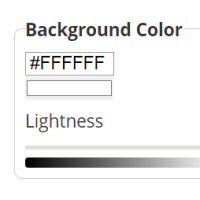
Aditya: Loved the layout but Always use - https://webaim.org/resources/contrastchecker/ to check you color contrast ratio . Please check the image below , how the contrast fails for the color you have used. The ratio should always be greater that 4.5:1 , Hope this helps. 🙂
Monika Mahor: thank you @adityarm for the observation I'll surely try to improve the colors 🙂
Day 3 Design Challenge
Website for personal portfolio.
#Fiz #Quarantine
check in browser
https://marvelapp.com/57bi54i/screen/68722091
Website for personal portfolio.
#Fiz #Quarantine
check in browser
https://marvelapp.com/57bi54i/screen/68722091
Julia Taranik: Hi Monica, I really like your home page. The only thing is that it's hard to read the grey font (e.g. freelance UI/UX....). I would recommend increasing color contrast
Monika Mahor: Thanks Julia for pointing out, I will surely take your point into consideration and will try to improve the design 😊
Day2
#fiz #quarantine #Day2 #DesignChallenge #FizdayhomeUI
web link
https://marvelapp.com/57bi54i/screen/68673327
mobile prototype link
https://invis.io/5XX1SJ2PHJY#/415552489_one_App_Onboarding_9_Copy_4
#fiz #quarantine #Day2 #DesignChallenge #FizdayhomeUI
web link
https://marvelapp.com/57bi54i/screen/68673327
mobile prototype link
https://invis.io/5XX1SJ2PHJY#/415552489_one_App_Onboarding_9_Copy_4
Day1 design challenge
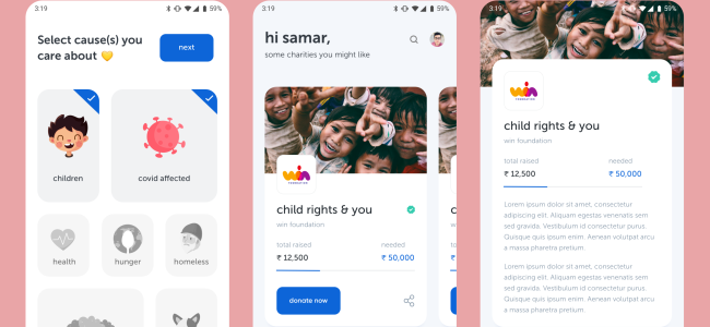
Donate money to charity app screens
#fiz #quarantine
invision prototype link
https://invis.io/5XX1SJ2PHJY#/415362514_one_App_Onboarding_9
Donate money to charity app screens
#fiz #quarantine
invision prototype link
https://invis.io/5XX1SJ2PHJY#/415362514_one_App_Onboarding_9


