Day 7: Design a Website UI for Finding a mentor
The past week has been quite challenging, fun, creative, and innovative.
A huge thank you to team Fizday for an amazing initiative.
Specially @antivirusakash
Win or lose, the best part about this entire challenge has been the experience.
You look at amazing designs all around you and learn bit by bit.
A huge shoutout to all the designers.
Thank you once again
Prototype Link:
https://invis.io/SWX4LL35QXN#/416124408_Web_1366_-_5
#fiz
#quarantine
#designchallenge
Post
Day 6: Design a Website UI
For this particular challenge, I decided to redesign the Website UI for Vistara.
Vistara Airlines has a very basic website, which looks a bit outdated.
Here's my take on the redesigned UI, making the website easier to use, and more user friendly.
#fiz
#quarantine
#designchallenge
For this particular challenge, I decided to redesign the Website UI for Vistara.
Vistara Airlines has a very basic website, which looks a bit outdated.
Here's my take on the redesigned UI, making the website easier to use, and more user friendly.
#fiz
#quarantine
#designchallenge
Day 5: Design a chatbot UI
Problem statement: The chatbot that I've worked on is a suggested add-on feature for the Freeletics App. The App has an in-built system known as Coach which is responsible for providing curated workouts. Here's my take on the Chatbot system that Freeletics can adopt in order to reduce the number of steps taken by a user to find a specific workout.
#fiz
#quarantine
#designchallenge
Dark Mode UI Interaction
Day 5: Design a chatbot UI
Problem statement: The chatbot that I've worked on is a suggested add-on feature for the Freeletics App. The App has an in-built system known as Coach which is responsible for providing curated workouts. Here's my take on the Chatbot system that Freeletics can adopt in order to reduce the number of steps taken by a user to find a specific workout.
#fiz
#quarantine
#designchallenge
UI Interaction for Chat Bot
Day 5: Design a chatbot UI
Problem statement: The chatbot that I've worked on is a suggested add-on feature for the Freeletics App. The App has an in-built system known as Coach which is responsible for providing curated workouts. Here's my take on the Chatbot system that Freeletics can adopt in order to reduce the number of steps taken by a user to find a specific workout.
#fiz
#quarantine
#designchallenge
Day Bonus Challenge
Answer to The Design Interview Questions: #interview
Link: https://docs.google.com/document/d/1JeTpZ7bpNx_we4BdlhgCnpZoJr9DeBHB😈Kwf2-GimM/edit?usp=sharing
#interview #fiz #quarantine #designchallenge
Answer to The Design Interview Questions: #interview
Link: https://docs.google.com/document/d/1JeTpZ7bpNx_we4BdlhgCnpZoJr9DeBHB😈Kwf2-GimM/edit?usp=sharing
#interview #fiz #quarantine #designchallenge
docs.google.com
Day 6: Redesigning Home and Contact page
Craigslist - Home page
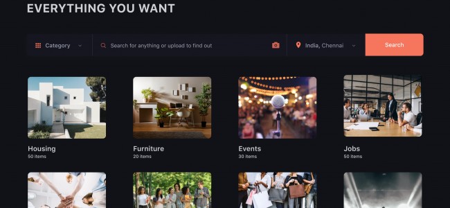
I decided to reimagine Craigslist as it is a mess finding what you want amidst of 100 other things listed out there. My main objective was to declutter the page and help people find the categories in a single scan for which I have incorporated images as well. Instead of having every section staring at the user's face, the main page has been reduced to highlight the search bar and the main categories that are available without overwhelming the user. The number of items available in each category is also listed to the user and the user could also search for an item by uploading its photo.
A typical Craigslist user expects to have a functional and fast user experience to see what they want to.
Craigslist - Contact page
Craigslist contact page doesn't guide the user in any way to help them out. I have incorporated a search bar also if the user has questions apart from the help topics that are listed out. A user could switch between advertiser and purchaser according to their needs.
The website has been given a total uplift by adapting to the go-to Dark mode.
#fiz #quarantine #designchallenge
I was busy with my work. That's why I post this. I made it at that time. when I was started learning Ui / Ux, It's great for me at the time but not now.
#fiz #quarantine #designchallenge #lightmode #darkmode
#fiz #quarantine #designchallenge #lightmode #darkmode
Day 5: "Design Chatbot UI for Light Mode and Dark Mode"
Interactive Prototype in Light mode
#fiz #quarantine #designchallenge #lightmode #darkmode
Interactive Prototype in Light mode
#fiz #quarantine #designchallenge #lightmode #darkmode
Day 5: "Design Chatbot UI for Light Mode and Dark Mode"
I always get frustrated while booking movies online because I never get the theater and the seats I want in the first go and it really takes a lot of time to manually see all the options. So, my idea is to create a virtual assistant that makes the booking process easier. It also shows the number of seats available according to the user's preference and suggests alternate options if the user was unable to find the theater as per his choices.
#fiz #quarantine #designchallenge #lightmode #darkmode


