Bonus Challenge
1. Can you tell us about yourself?
I am Varshini, I am an Engineer turned into a Designer. I started to learn about UX/UI Design at the end of my college semester and it sparked an instant interest in me to delve deep into it. I am a person of the strong belief that keeping things simple and usable is the utmost priority in designing. I am also a professional Badminton player and artist. I love doing creative activities as it opens up my mind and that freedom is what I strive to achieve in design.
2. What Made You Go Into UX Design?
I started by reading a lot of articles about UX and I realized it is about understanding human needs and empathizing with them. When I got to know the process, I started looking at everything from a user experience perspective. It is the learning curve that I have got in this field which keeps me going and this is not present in most other fields. This is something that involves psychology, human emotions, feelings, culture, and business strategy where there is always a scope to learn and improve yourself.
3. What’s Your Favorite Project You’ve Ever Worked on?
My favorite project I have worked is on Gmail Redesign and the Charity App for donations. Gmail Redesign was a bit challenging as I had to redesign a platform that is being used by everybody in the world and I think I tried to bring something new to the floor.
Charity App was just more than design to me, as it really connected to the people who are suffering without the essentials and how we could project those emotions to people who would be using the app.
4. What Are Some Websites and Apps Whose Design You Love? Why?
Dribbble - The simplicity of it and how easy it is to use.
Netflix - I absolutely love their UX, it always finds a way to keep the user engaged by suggesting more movies similar to our search and love their brand.
Uber - Uber stands out from the other cab booking apps as it is extremely usable and has a decent custom care support.
5. How Do You Define UX?
UX is in our everyday life, in whatever we do, there’s UX associated with it. It is really about making the process simple for a user to use and always to take their feedback and improvise on it. It reveals interesting insights and could make life very easier in this digital world.
6. WHAT INSPIRES YOU TO CREATE YOUR DESIGNS?
To create stunning designs and to actually understand and user problems are what inspires me to create my designs. I simply look around me and wonder how the earth has designed everything so perfectly, there is a lot to learn from our environment.
7. Who are your design heroes?
Chris Do, Johny Vino, and Don Norman.
#fiz #quarantine #interview
Post
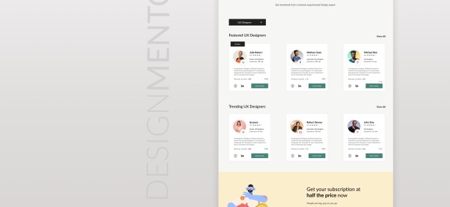
Day 7: Design a UI Landing Page to Find Designer Mentors
https://www.figma.com/proto/Aj1YhquuTswQzKAzZAV35e/Design-mentorship-website?node-id=31:0
#fiz #quarantine
https://www.figma.com/proto/Aj1YhquuTswQzKAzZAV35e/Design-mentorship-website?node-id=31:0
#fiz #quarantine
Akash Solanki: @varshini97 It's good if you've given the link. Can you tell me size of image you're uploading?
Day 6: Redesigning Home and Contact page
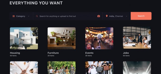
Craigslist - Home page
I decided to reimagine Craigslist as it is a mess finding what you want amidst of 100 other things listed out there. My main objective was to declutter the page and help people find the categories in a single scan for which I have incorporated images as well. Instead of having every section staring at the user's face, the main page has been reduced to highlight the search bar and the main categories that are available without overwhelming the user. The number of items available in each category is also listed to the user and the user could also search for an item by uploading its photo.
A typical Craigslist user expects to have a functional and fast user experience to see what they want to.
Craigslist - Contact page
Craigslist contact page doesn't guide the user in any way to help them out. I have incorporated a search bar also if the user has questions apart from the help topics that are listed out. A user could switch between advertiser and purchaser according to their needs.
The website has been given a total uplift by adapting to the go-to Dark mode.
#fiz #quarantine #designchallenge
Day 5: "Design Chatbot UI for Light Mode and Dark Mode"
Interactive Prototype in Light mode
#fiz #quarantine #designchallenge #lightmode #darkmode
Interactive Prototype in Light mode
#fiz #quarantine #designchallenge #lightmode #darkmode
Day 5: "Design Chatbot UI for Light Mode and Dark Mode"
I always get frustrated while booking movies online because I never get the theater and the seats I want in the first go and it really takes a lot of time to manually see all the options. So, my idea is to create a virtual assistant that makes the booking process easier. It also shows the number of seats available according to the user's preference and suggests alternate options if the user was unable to find the theater as per his choices.
#fiz #quarantine #designchallenge #lightmode #darkmode
Day 4: Responsive Resume Form
Resumes are just looked at for about 5 to 7 seconds and we need the make a killer impression in those crucial seconds to stay ahead in the competition. I wanted to implement a Real-time resume template with the form as it really helps to structure my content and produce a good resume.
This task was a little challenging, I tried my best to solve the. problem.
#fiz #quarantine
Day 3: Portfolio website
I wanted to try out the dark theme and tried out different typography to take it up a notch. My portfolio is a reflection of my personality that is simple and bold.
( P.S: View it in full screen )
#fiz #quarantine #designchallenge
I wanted to try out the dark theme and tried out different typography to take it up a notch. My portfolio is a reflection of my personality that is simple and bold.
( P.S: View it in full screen )
#fiz #quarantine #designchallenge


